
Initial Consultation & 2D Space Plan
Floor plan, needs, furniture, storage, target budget and property constraints are translated into a workable layout.
Design style · Singapore
A monochrome interior depends on tonal range and texture, not simply black and white. Matte and reflective surfaces, warm and cool greys, shadow gaps and lighting create depth while a limited palette keeps the home visually consistent. Singapore daylight can be strong, so the palette is balanced around orientation and room depth to avoid harsh contrast in bright spaces or flatness in darker internal zones. A practical Singapore interpretation uses blackened metal, warm grey, off-white, textured surfaces, glass, stone and controlled timber accents, plans storage and circulation before decoration, and typically uses warm architectural lighting around 2700K–3000K for living areas while task lighting is tuned to the activity. Material specifications should be checked for tropical humidity, cleaning and the actual substrate rather than copied from overseas reference images.
Design principle
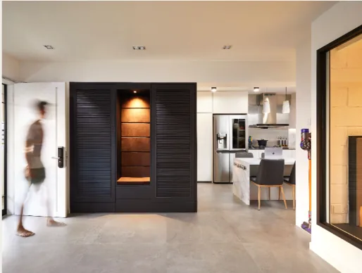
Singapore daylight can be strong, so the palette is balanced around orientation and room depth to avoid harsh contrast in bright spaces or flatness in darker internal zones.
Tonal hierarchy
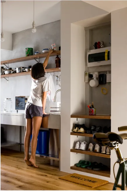
Off-white, mid-grey, charcoal and black can be distributed according to surface area and light. Large planes usually benefit from softer tones, while darker elements can define frames, furniture or selected joinery.
Texture prevents the scheme from feeling graphic and flat. Stone grain, fabric, timber and ribbed glass introduce depth without adding new colours.
Lighting
Direct downlights alone can create hard contrast. Layered ambient, task and accent lighting helps dark surfaces remain readable and keeps pale surfaces from becoming overexposed.
In compact HDBs and condos, reflective black surfaces are used selectively because fingerprints and glare can become a maintenance issue.
Material palette
A successful monochrome palette uses several values and textures: warm off-white, greige, mid-grey, charcoal, blackened metal, glass and controlled timber. Sintered stone can create a consistent low-porosity surface in kitchens, while microcement-look finishes add texture when the substrate and sealing system are suitable. Natural oak can be kept desaturated so warmth does not break the tonal discipline.
Material samples should be viewed in both daylight and artificial light. Batch variation, joint lines, edge profiles and sealers can change the final effect, so the design should document not only the material name but also where it starts, stops and meets adjacent finishes.
Spatial planning
Use dark elements to frame circulation or storage rather than covering every large surface. In compact homes, lighter walls and ceilings can preserve reflected daylight while charcoal joinery or metal gives depth. The plan should prevent dark full-height cabinets from narrowing already-tight corridors.
Storage, door swings, furniture depth and circulation are resolved first. Decorative gestures then reinforce those decisions instead of competing with them. This is especially important in compact HDB and condo homes, where every additional full-height element changes daylight and perceived width.
Lighting guide
For most living and hospitality-style residential zones, 2700K–3000K lighting supports a warm material palette without making timber or stone look orange. Combine ambient light with task and accent layers rather than relying on a dense grid of downlights. Colour rendering, beam angle, glare control and dimming are often more important than wattage alone.
Kitchen worktops, wardrobes, desks and artwork may need separate task or accent light. The lighting plan should be coordinated with ceiling details, air-conditioning grilles, sprinklers where applicable and carpentry so fixtures do not collide with doors or shelves.
Tropical performance
Matte black, ribbed glass and textured surfaces show dust, fingerprints and water marks differently. Material samples should be tested against the homeowner’s cleaning tolerance, and wet-area dark finishes should be chosen with limescale and maintenance in mind.
Natural stone such as travertine can require sealing; timber and veneer need appropriate finishing and moisture control; limewash or mineral-style coatings depend on compatible substrates; and sintered stone still requires correct support, edge fabrication and joint detailing. A style is successful only when it remains practical after years of cleaning, air-conditioning and daily use.
Renovation workflow
The exact scope varies by project, but the working sequence keeps planning, approvals and fabrication ahead of site dependencies.
Floor plan, needs, furniture, storage, target budget and property constraints are translated into a workable layout.
Key volumes, carpentry and material relationships are developed so major visual decisions are understood before fabrication.
Applicable approvals, demolition, wet works and building-management requirements are coordinated for the agreed scope.
Fabrication, installation, finishing and agreed completion checks lead into handover and documented rectification items.
Quick answers
No. A strong monochrome scheme usually uses several related tones plus texture, lighting and material variation.
It can if contrast and lighting are poorly controlled. Dark colours can still work when the room has appropriate light, reflective balance and clear circulation.
Yes. A controlled timber accent can warm the palette without breaking the overall tonal discipline.
A warm 2700K–3000K range works well for many living and dining areas because it complements timber, stone and textured finishes. Task areas may need different output or colour temperature depending on the activity.
Bring your references
Style becomes useful when it works with storage, circulation, maintenance and the property rules.
Send us your property type, floor plan and expected key or handover date. We’ll continue the conversation on WhatsApp.
Start WhatsApp chat +65 8889 9899